 At a recent marketing conference I attended, the audience was asked if we’d ever lied while filling out a form online. A quick poll showed a majority of people said yes. The reasons varied from person to person, but the underlying themes were the same: not knowing where their information was going, how their data was being stored, or what it would be used for.
The takeaway? Smaller forms can can cut down on this mistrust and lead to increased engagements. Over the years, many studies have shown this, and companies like QuickSprout, HubSpot, and KissMetrics all have content that draws a simple conclusion: less means more.
But what about recent studies that showed reducing the number of fields can also decrease the number of leads your site receives? Which side should you trust?
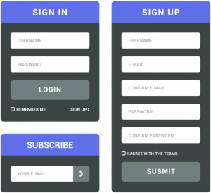
There is no magic number of form fields, but at cj Advertising, our best practice is to keep forms simple and only ask for information you absolutely need to help your potential clients. If you only need a name, phone number, and quick description to get started, make the process to submit a form as easy as possible.
If you require more information, like state, zip code, or email address, then go ahead and ask for those details. But don’t be surprised when some of the information you receive is incorrect or misleading. If you begin to think of extra fields or inputs as potential roadblocks between you and your potential clients, the better—and more accurate—your results will tend to be.
UX designer and author Whitney Quesenbery is often cited for her 5 E’s that sum up desirable form characteristics:
- Efficient
- Effective
- Engaging
- Error tolerant
- Easy to learn
If your forms—and your site—meet all of these criteria, you’ll be on the right path to getting more forms and more conversions. For more information, leave a comment or contact me at bcombs@cjadvertising.com.
Thanks for reading!