Strong personal injury marketing gets people to your website. If your site isn’t built around how injured people make decisions (fast, on a phone, under stress), the traffic you purchased through TV spots, paid search, and LSAs is quietly bleeding out to your competitors.
Too many PI websites are built to look impressive rather than to help an injured person quickly understand, trust, and contact the firm.
Why This Matters for PI Firms
In personal injury, your website is not just a digital brochure. It is the first serious evaluation point after someone sees your firm on TV, clicks a paid ad, finds you in local search, or looks you up after a referral.
That visitor is typically not browsing casually. They may be in pain, worried about missing work, or trying to figure out whether they can trust the firm enough to make a call. If the site feels slow, cluttered, confusing, or disconnected from the ad that brought them there, hesitation sets in fast.
That is why conversion-focused web strategy matters. Creative gets the click. The site must connect users to your intake team.
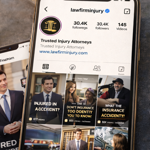
Most Law Firm Websites Are Built to Impress, Not Convert
Many law firm websites are designed around internal preferences rather than client behavior. They showcase the firm’s history, stack every credential on the homepage, add oversized attorney sliders, and load the page with dense copy that asks too much from a first-time visitor.
That may look polished on the surface, but it often misses what an injured person needs in the first few seconds. They are not looking for a long brand essay. They are looking for reassurance, clarity, and a next step that feels easy.
The strongest PI websites do not try to say everything at once. They help the visitor answer a few immediate questions quickly: Am I in the right place? Does this firm handle cases like mine? Do I trust these people? What should I do next?
In our experience, the websites that convert best remove friction first. The ones that perform worst are usually the ones that tried to show off the most.
What Injured Visitors Actually Need
Personal injury prospects are scanning your site quickly and under stress.
That changes what matters most. Before they read your longer copy, they are reacting to its structure, spacing, imagery, calls to action, reviews, and overall polish. Design communicates before copy does. A modern, clear layout can signal professionalism and stability right away. An outdated or overcrowded page can create doubt before a single sentence gets read.
The practical priorities are:
- Clear reassurance: Visitors need to know they are in the right place and that your firm handles problems like theirs.
- Visible trust signals: Testimonials, review volume, recognizable awards, media mentions, attorney credentials, and case-result framing help reduce skepticism quickly.
- An obvious next step: Tap-to-call and “contact us” buttons, short forms, and clean calls to action matter more than clever design features.
The Biggest Conversion Barriers Are Usually Not Dramatic
PI websites fail because of several smaller points of friction stacked together.
Speed
Google says that more than half of overall web traffic comes from mobile, and faster mobile experiences improve page views and conversions. When a PI site loads slowly, especially on a phone, firms lose people before the intake team ever gets a chance.
Usability
The form is too long, the targets are too small, the phone number is hard to find, or the navigation asks a visitor to think too much. None of those issues sound big on their own, but together they create enough friction to stop action.
Messaging
A visitor clicks because of a specific promise, case type, or value proposition in an ad, but lands on a generic page that feels disconnected from the original message. That drop in continuity can quietly cut conversion.
If the page doesn’t explain what happens next, the form sets the wrong or vague expectations. Then, the user’s experience from submission to human response feels vague.
What User Behavior Data Reveals
User behavior data is where internal assumptions tend to break down.
Our research on website behavioral data routinely shows that firms overestimate what visitors will read. Users make decisions faster, skip more content, and rely on trust cues earlier than most law firm marketers expect.
The strongest information should not be buried halfway down the page. Key trust signals should not be hidden behind sliders or tabs. Calls to action should not compete with five other priorities.
When firms start looking at real behavior rather than internal preferences, better website decisions follow. That is also why web design and development for personal injury law firms should be tied to the performance data rather than aesthetics.
What Better Website Strategy Looks Like
A better-performing PI website is simpler than firms expect. It does not mean stripping out the brand or removing the substance. It means making the website easier to trust and easier to use.
A strong approach includes:
- Mobile-first structure: Build for the first visit on a phone, not the desktop review in the office.
- Conversion-first page design: Make the primary action clear and reduce competing distractions.
- Stronger trust placement: Bring reviews, credibility markers, and proof points higher on the page.
- SEO-ready structure: Organize content so the site can rank and convert, instead of choosing one or the other.
- Closer intake alignment: Treat forms, calls, and follow-up expectations as part of one connected acquisition process.
That is how we think about website strategy at cj Advertising. The site should support the attention your marketing already creates, not waste it.
Tools and Resources That Make Execution Easier
Use the right tools to see what is working and fix what is not.
- Heatmaps and click tracking: These help show where users focus, where they hesitate, and what they ignore
- Google Analytics 4 (GA4): Useful for understanding traffic patterns, landing-page behavior, and conversion pathways
- Call tracking and form tracking: These help connect design decisions back to lead-generation outcomes
- Intake-focused form strategy: Shorter forms, clearer expectations, and cleaner routing can reduce drop-off
The firms getting more from their websites are usually not the ones chasing the flashiest redesign. They are the ones treating their site like a working growth asset.
Want a Website that Converts?
When design, trust, speed, message, and intake work together, the site works harder for your firm and captures the leads and interest generated by your paid marketing.
If your site is driving traffic but not enough leads, request a free website audit, and we’ll show you exactly where it’s breaking down and what to fix first.